4.3 Carbon cycling

1.The diagram shows the carbon cycle. [Source: © International Baccalaureate Organization 2017] Which two processes correspond to the labelled arrows?


2. The diagram shows a version of the carbon cycle. What is indicated by the numbers?


3. Cladograms can be created by comparing DNA or protein sequences. The cladogram on the left is based on DNA sequences and the cladogram on the right is based on comparing protein sequences. 
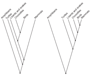
What is the reason that cladograms based on DNA sequences are more reliable predictors of the phylogenetic relationship of species than cladograms based on protein sequences?


4. What favours the production of peat? I. Presence of organic matter II. Anaerobic conditions III. Acidic conditions


5. The bacterium Neisseria gonorrhoeae causes infections related to the human reproductive system. The graph shows the percentage of samples in which this bacterium showed resistance to six antibiotics over a period of ten years. What is a possible explanation for the total percentage resistance being larger than 100% in 2010?


6. Methanogens produce methane gas. What is this gas converted to in the atmosphere?


7. What favours the production of peat? I. Presence of organic matter II. Anaerobic conditions III. Acidic conditions


8. How is peat formed?


9. The diagram represents the carbon cycle. Which process has the greatest relative role in transferring carbon?


10. Which hypothesis is supported by evidence from ecological research?  


11. What are examples of greenhouse gases?


12. The diagram is a representation of a carbon cycle. Which arrow will reduce the greenhouse effect?  


13. The diagram shows the carbon cycle. Which letter indicates respiration?


14. Which group of organisms in the carbon cycle converts carbon into a form that is available to primary consumers?  


15. The diagram below shows some of the links in the carbon cycle. What processes are taking place at I, II and III?


16. The graph below shows variation in the concentration of CO2 in the atmosphere as measured at Mauna Loa in Hawai’i. The small inset graph shows the variations in CO2 during a one year period. Why does the amount of CO2 fall between April and August?


17. The following graph refers to questions 19 and 20. It shows variation in the concentration of CO2 in the atmosphere as measured at Mauna Loa in Hawai’i. The small inset graph shows the variations in CO2 during a one year period. Why does the amount of CO2 fall between April and August?


Leave a Reply

Your email address will not be published. Required fields are marked *

WhatsApp chat